I’ve had a week and a bit playing with the Apple Watch, pretty much all of that time being on flights and at events which is probably not a normal usage representation, but it’s certainly given me a chance to give it a good workout. Some stuff is good, some is bad and a bunch of it is quite frankly absolutely pointless. But I expected that – it’s what you get with first gen tech – what I was more interested in is how it changes the way I might do otherwise normal everyday stuff.
Pictures speak louder than words in this case so I’ve just been snapping interesting stuff as I’ve gone along. Let me show you what I’ve found.
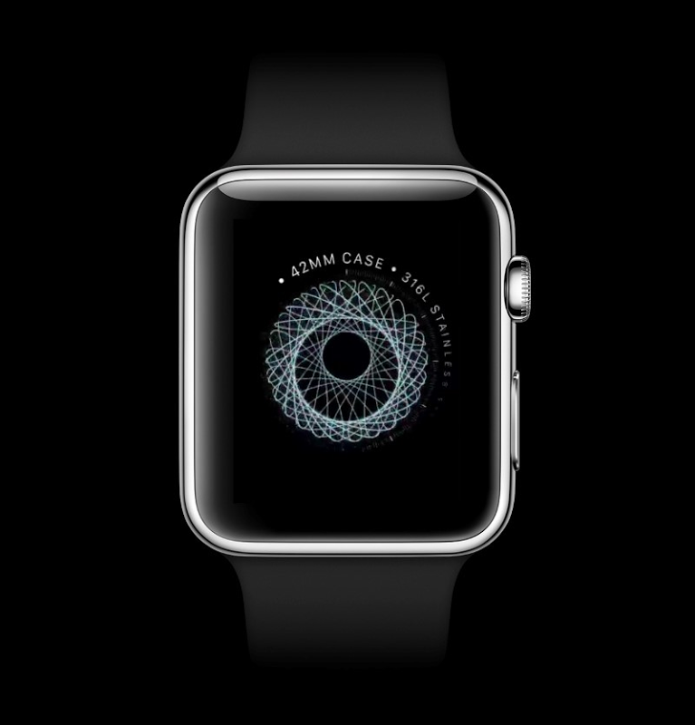
It’s beautifully made
You kinda expect that from Apple and they’ve definitely delivered on that front. It could be thinner (and that will no doubt happen in future gens), but compared to something like a Pebble, it’s definitely a much nicer piece of gear. This is the “Watch” Apple Watch rather than the “Watch Sport” Apple Watch so it gets the stainless steel body and sapphire glass.
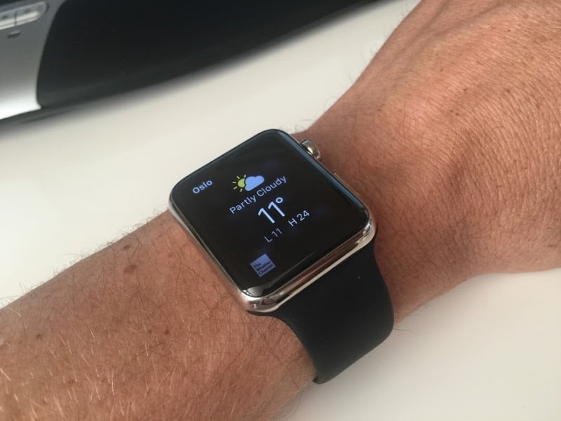
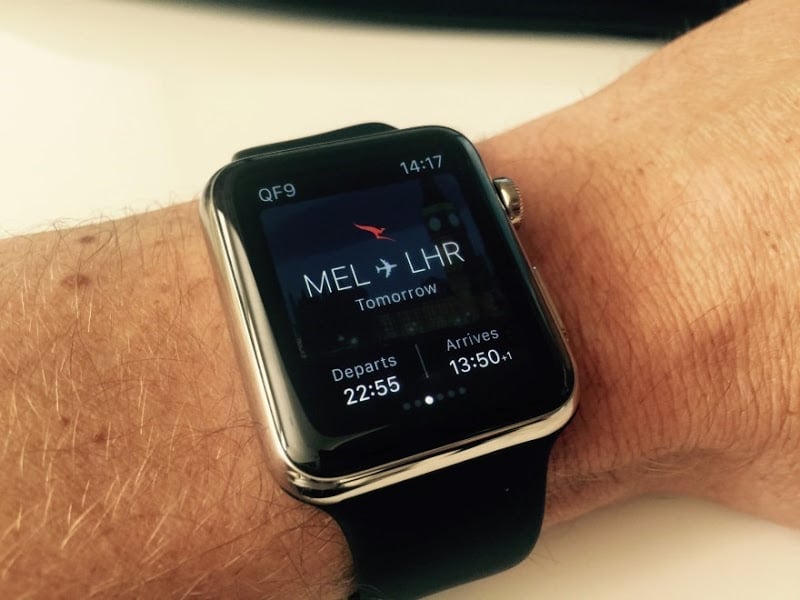
Some use cases are just perfect for it
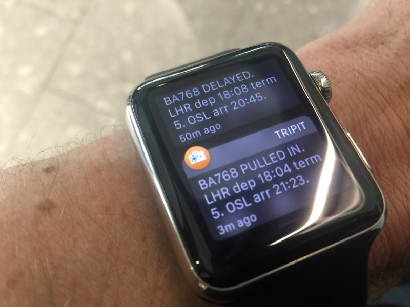
Flight info is awesome. Qantas does a great app which is really easy to glance at while you’re working. You might argue that it sounds stupid to say that taking your phone out of your pocket is too laborious, but there is a very different usability proposition to info available at a glance as opposed to that which is secreted away on a device in your pocket. Same deal with TripIt – seeing things like flight delays pop up on your wrist is just perfect.
I crashed it
I tried going into energy saving mode and, well, it kinda crashed. I haven’t been able to do this specifically again, but I’ve had many occasions where it’s hung or an app has been pretty much unresponsive. It’s certainly not a consistently stable experience yet, particularly with a bunch of the third party apps.
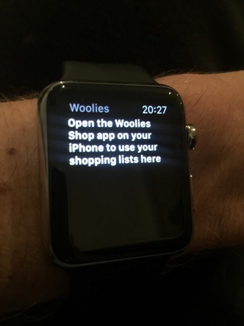
An app telling you to go to your phone is pointless
Why oh why would you do this?! Either build an app that works on the watch or don’t do one at all. Telling someone on their watch to go to their phone is just plain stupid. Now maybe I have to go to the phone to setup the watch, I don’t know because after this initial experience I didn’t feel much like using the app at all! It reeks of “we need a presence on the watch – just do something!”
Be careful what you say near it…
I must have just opened the Amazon app or done something that got me into that context, but without realising the ramifications, I made a comment on something I saw on TV. This is not fabricated – next moment I look down at the watch and, well, yeah. Of course the phone has had voice recognition in one form or another, but I must admit that the watch listening to me caught me off guard. It’s more omnipresent than the phone and that’s an important fact to remember.

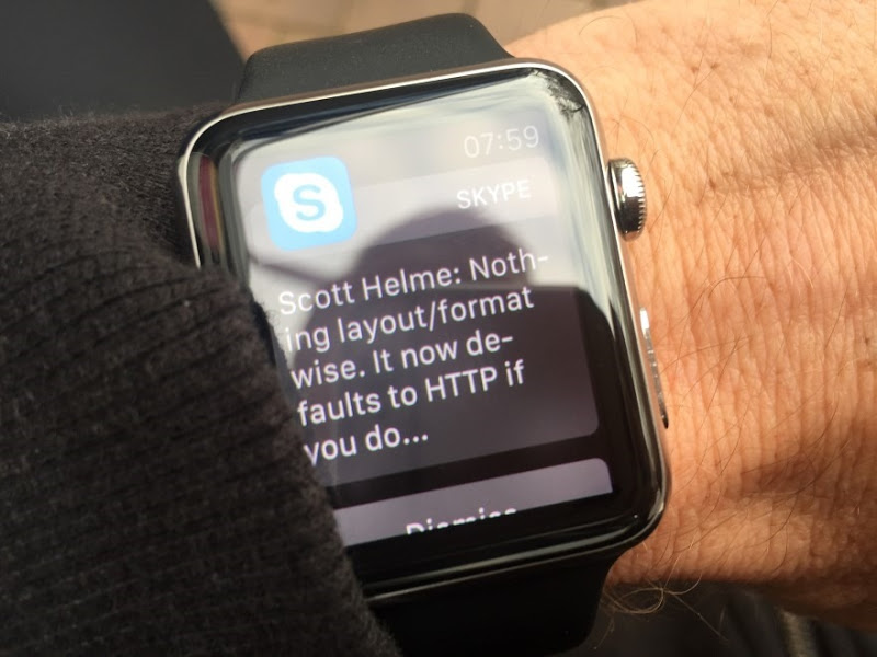
Short notices work beautifully
A quick glance at Skype or a new email, for example, works really well. Having to scroll or drill down is less effective so of course it’s very dependent on the nature of the app and the length of the message. Cases like this though are beautiful – feel the tap on the wrist, glance at it and that’s all you need.
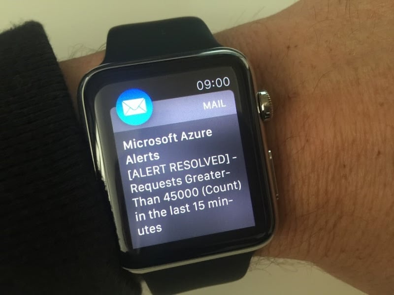
Glances on the go are awesome
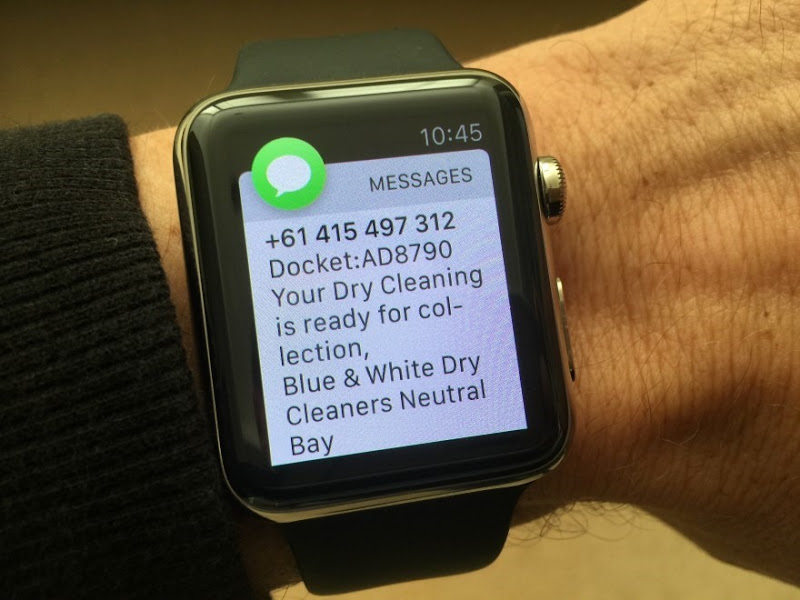
A bit similar to the airline app use case, I was walking home from the shops the day I got it and with bags in hand was able to see the following message, turn around and get my dry cleaning. Again, I know it might sounds weird, but there’s just a lower barrier to entry for this sort of interaction which really trumps the phone experience.
Fitness has a lot of potential
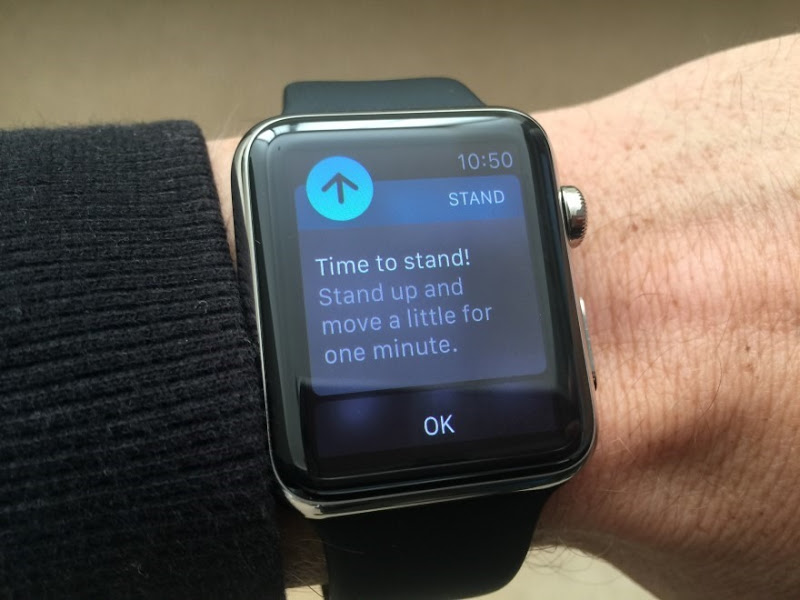
I say “potential” because whilst it’s quite neat right now, it feels like there’s a much more valuable use case hidden in there somewhere. Having said that, even the standing guidance is a good reminder that perhaps sitting at the desk nonstop all day isn’t such a good idea. We know this, of course, but having the device tell you this does prompt action which you may not have otherwise taken.
Sending quick messages or emoticons is kinda neat…
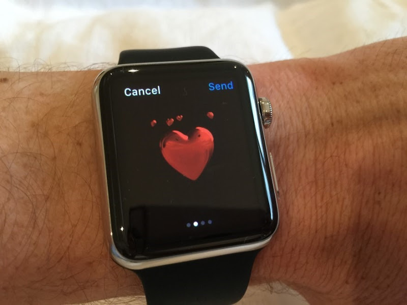
I’m sure it resonates more with certain demographics, but the watch is pretty handy at quickly tapping out pre-canned messages. Same again with emoticons such as this lovely heart with little spinning hearts around it, right…?
…but not everyone will share you enthusiasm
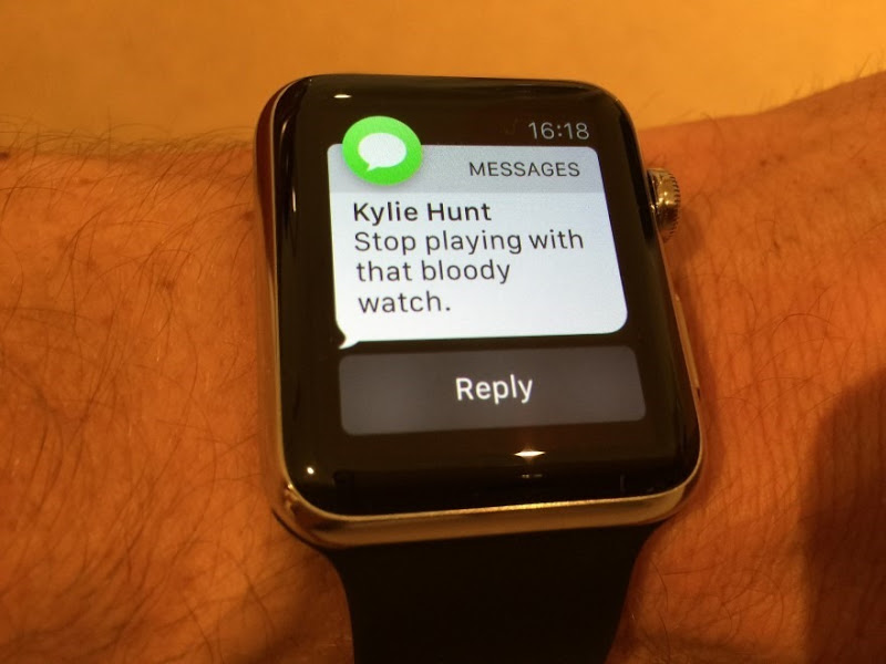
Your novelty factor can be another person’s annoyance! I actually find most people pretty interested in what it is and what it does, although admittedly some of them fail to get excited about it…
It reduces the “time to penis”
I didn’t know that was even a thing, yet here we are – TTP. Once my brother got his hands on his wife’s watch, this novel use case became immediately clear. I actually missed snapping it the first time an old fella appeared on my watch so I had to ask for another to be drawn. This caused a different problem…
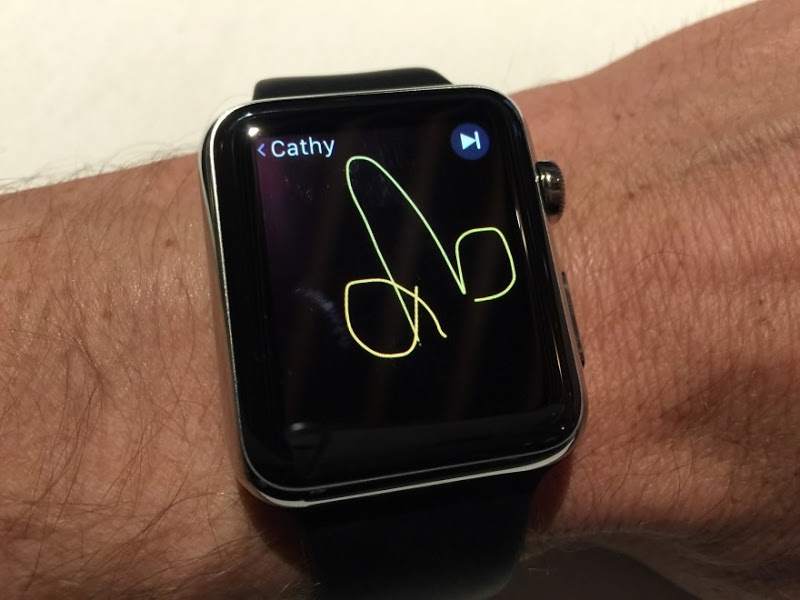
It’s another channel of potential privacy violation (or embarrassment)
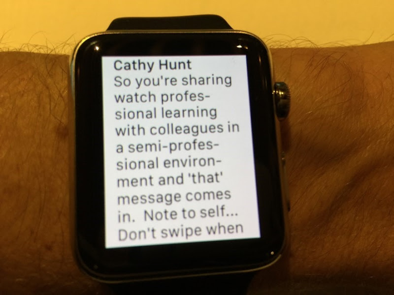
When you ask someone with an Apple Watch to, say, draw you another penis, it’s worthwhile keeping in mind the setting in which they may receive that message. Of course we could always embarrass people in similar ways with phone or other device that pops up a message, this is just one more channel now.
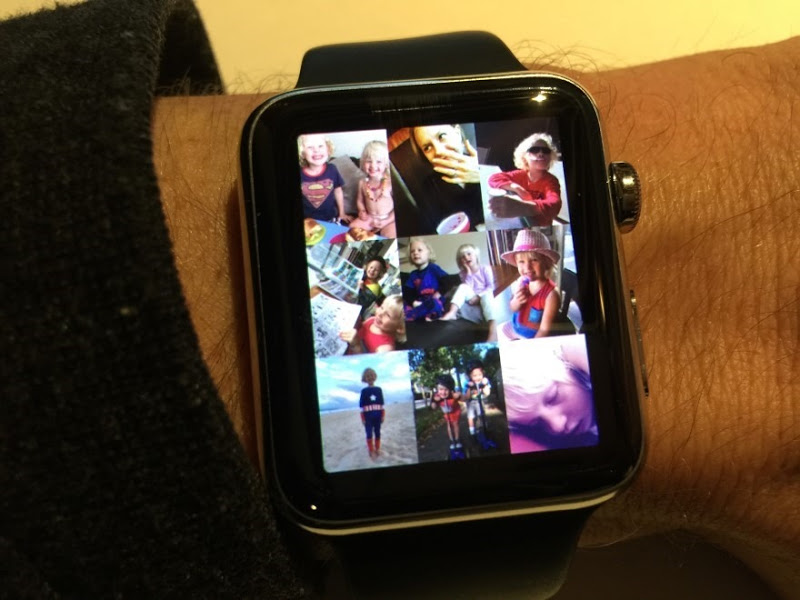
Photos are kind of pointless
I’ve looked at them several times for the novelty value, but to take a photo with the clarity you get from a device like an iPhone 6 Plus then drop into the watch to look at them is just pointless. If you want to look at photos, use the device that does it well!
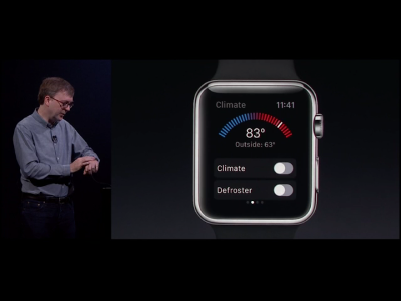
Just because you can, doesn’t mean you should
I snapped this pic from the WWDC keynote the other day with my mind thinking “Who the hell wants to control their car climate control via the watch while they’re sitting in it?!” Of course this is my Australian-centric mind thinking and I’m conscious there are places in the world where you need to warm your car before getting into it. But it seemed feasible – that someone would create an app to use whilst in your car – because so many are rushing to put things on the phone which might be completely and utterly ridiculous!
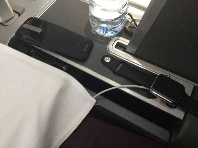
More charging…
On my way over to Europe, I found I had to charge it in-flight or it wouldn’t have lasted the 38 hour journey (don’t get me started – changing flights with late notice to the European summer is a nightmare). I’ve had no problem with it lasting a full day and still having heaps of battery left (often more than half), but if you’re overnighting then there’s another thing you’ll need to have with you.
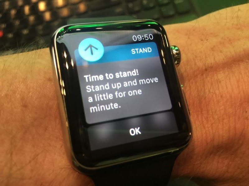
It’s not as smart as it thinks it is
I stood there watching the keynote at the NDC conference in Oslo last week because that’s what we had to do – it was a standing only event. I stood for so long I really wanted to go and grab a seat; and then the watch told me I should stand up! Obviously it hadn’t realised I was already standing and it wasn’t exactly what I wanted to see while feeling weary!
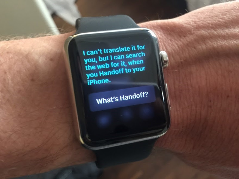
Device switching is clunky
This sort of thing – where the watch tells you to go to another device – is enormously annoying. I’d asked Siri for a currency conversion (Siri is actually awesome on the watch… when it works) and instead I’m told to go to my phone. That’s just plain annoying and it seems like the sort of thing the watch should be able to get right.
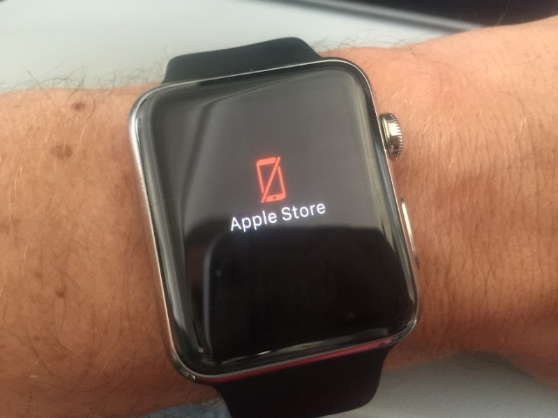
Don’t forget that the watch is just a thin client
Spending all that time on planes in flight mode means I saw a lot of this. The watch is extremely dependent on the phone and to a degree, I kind of get it – it’s effectively a thin client. That will change to some degree when native apps hit in the second generation OS and of course being able to communicate over wifi on its own will also go some way to freeing it. For now though, no phone or flight mode means a lot of stuff just not working.
Doing some things on the phone makes a lot of sense
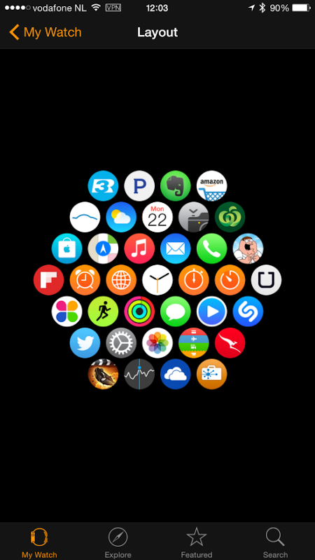
I’m quite ok with “dropping back” to the phone for certain activities. Rearranging the app screen, for example, or choosing which apps should be installed. This would be a miserable experience on the watch itself and it’s one that’s irregular enough to justify pulling the device out of your pocket. It also reinforces why the watch really needs an iPhone – you’re plugging deep into the Apple ecosystem here in terms of things like connecting to the app store and I get why that’s just not going to make sense on an Android or other device. (Incidentally, the somewhat strange collection of apps is for a little hacking event I’m doing at a Dutch user group tomorrow night – I wouldn’t normally be running the Family Guy app, but I reckon there might be some curious things to find in there…)
Summary
This is really pretty much what I expected – a bunch of neat stuff, a bunch of pretty rough stuff and lots of ideas on how it might change the way we actually work or play or do whatever. In that regard it’s pretty revolutionary not because Apple is the first to do it, but because they’ll be the first to bring it into the mainstream.