The first few parts of this series have all been somewhat technical in nature; part 1 was how much of a mess the IoT ecosystem is and how Home Assistant aims to unify it all, part 2 got into the networking layer with both Wi-Fi and Zigbee and in part 3, I delved into security. Now let's tackle something really tricky - humans.
I love the idea of automating stuff in the home, but I love the idea of a usable home even more. What do I mean by a "usable" home? Let me explain it in mum and dad terms or in other words, let's talk about the UX my parents have when they visit my house.
To begin with though, I want to be clear about what I mean by UX:
User experience (UX or UE) is a person's emotions and attitudes about using a particular product, system or service. It includes the practical, experiential, affective, meaningful, and valuable aspects of human–computer interaction and product ownership. Additionally, it includes a person's perceptions of system aspects such as utility, ease of use, and efficiency.
In my IoT travels, I've seen way too many cases where connected homes have become (in my opinion) geek havens at the expense of UX. I want to go through some of those examples and talk about how I've tackled it at home in a fashion that gives us the best of both worlds: connected stuff that's usable by everyone.
Light Switches
My parents aren't as tech orientated as me and whilst the idea of a connected home appeals greatly to me personally, I doubt they share quite the same level of excitement. That's fine, I'm not expecting them to geek out at my YAML or get giddy about my Zigbee, but I do want them to be able to use my house.
Light switches are a perfect example of where connected home UX can go down the toilet. My parents are great with light switches, in fact, they have a lot more experience with them than I do. They're very familiar with the simple premise of flicking a switch to turn a light on and indeed, flicking it again to turn it off. Problem is though, connected lights can create a bit of a conundrum here:
I was looking at doing exactly this with my downlights, but the idea of the wall switch annoyed me - if it's off, I can't then voice turn on the lights. How are you getting around it, or just banning anyone from touching physical switches? :)
— Adam Fowler (@AdamFowler_IT) August 13, 2020
Those lights are Atom WiZ Connected RGB LEDs and they talk directly to the Wi-Fi network. They need power to do that and the point Adam is making is that if the light switch on the wall is turned off and the connected light no longer has power, how can you control it digitally? I mean what if you turn it off at the wall then try to ask Alexa to turn it back on? It won't work as the light is now offline. The workarounds people create for this are, to my mind, sub-optimal:
Light switch guards. We have one over every switch that we don’t want used they come in colors or clear. They use the existing faceplate screws. pic.twitter.com/hN8VPt4g4n
— iain (@iain_b) August 13, 2020
If I bring this back to the parents test, how do my mum and dad use these switches? Clearly, they can't because that's the whole purpose of the covers, so how do they turn the lights on? I'm not sure how Iain does it, maybe by voice, maybe by motion, maybe by something else altogether. All I know is that from a UX perspective, switch covers are unquestionably an anti-pattern.
The solution needs to involve both kinetic and digital controls that work in a harmonious fashion and there are a couple of ways of going about this. For example, there's the likes of Lutron Caséta which combines everything into a replacement switch:
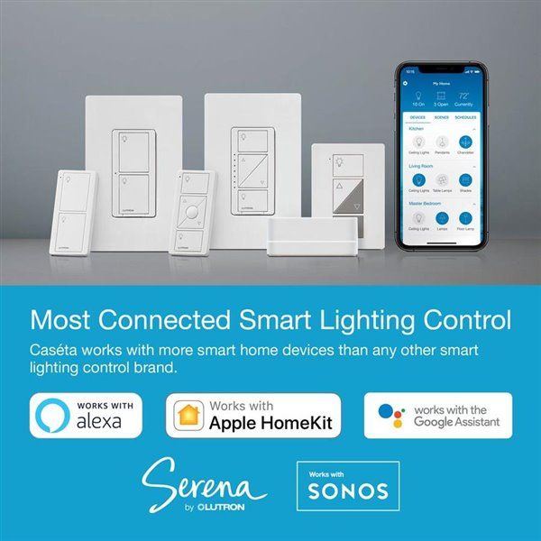
A lot of people seem keen on this approach (and there are similar examples such as LIFX's), and I understand the value proposition, but I have a couple of fundamental issues with it. The first is that going down this route means there's a completely different light switch on the wall. I have light switches already and although I'm replacing some of them during renovations, I don't want to have to replace them just to automate the circuits behind them. If I did decide to go down this route, they're not always going to be the same physical dimensions as the existing switches which leads to replastering and repainting work. Then there's the price and it's looking like about A$83 for a simple switch which I don't actually think is unreasonable for the physical unit plus IoT capability (not when some of the other non-IoT switches I bought were A$60 alone), but that's quite a premium over the alternate solution I'll talk about in just a moment. But lastly (and to me this is the biggy), I just don't like the idea of tying physical switches I'll place my fingers on day in and day out for at least the next decade or two to a digital implementation with firmware I've got no idea how long will be supported for. I much prefer the idea of abstracting the physical switch gear from the digital IoT bits, which leads me to my ultimate solution:
Fixed! Not my work (licensed electrician only), but this is the end result and it works *perfectly*! pic.twitter.com/HGSEawEIgv
— Troy Hunt (@troyhunt) September 8, 2020
The little blue units you see in foreground and background are the Shelly 1 relays I first mentioned in part 1 and their value proposition is that they're small enough to fit in behind existing switches. In fact, they're so small that the marketing around them compares them to the size of 2 Oreo biscuits:
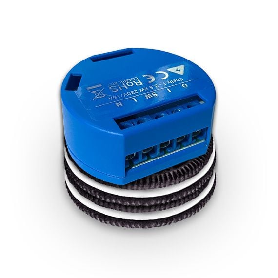
They're also cheap at A$30 each which makes them a lot more financially accessible than, say, the Lutron approach, especially once you start doing a bunch of switches. Further, they're also approved for use in Australia which is super important as alternatives such as the SONOFF BASIC my mate Lars recently purchased are not. (Important side note: do check that stuff like this is approved for your part of the world. The SONOFF's were attractive at only A$10, each but Lars ultimately had to return them and get Aussie approved Shellys instead.) So, what does the Shelly ultimately give you? Perfect harmony between kinetic and digital switches:
It’s beautiful 😢
— Troy Hunt (@troyhunt) September 8, 2020
This is precisely what I was after: digital and physical controls perfectly complimenting each other with neither suffering in the presence of the other. Will share a more full rundown of the room once work is complete but for now, the Shelly 1 just rocks 😎 pic.twitter.com/MKsefGQzbI
If my parents turn off the lights with the switch on the wall, I can turn them back on digitally either with the Shelly app or anything else that integrates with the devices (including HA). Same logic in the other direction too, in fact, there's no scenario in which either flicking the switch on the wall or toggling digitally doesn't do precisely what you think it should do. It's like everything works precisely as expected 😊 Almost...
Aligning Digital & Physical States
Let me explain the issue here with a simple visual representation; consider whether the following light switch is on or off:
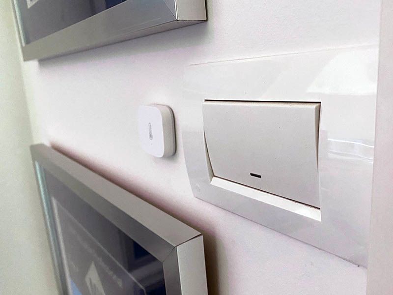
To my mind, when the switch is down like this then the light is on. When it's up the other way, it's off. My house is full of light switches like this, as are most houses. The problem I have with this when it comes to IoT is that if lights are toggleable via both kinetic and digital switches, the physical state of the switch is no longer a true representation of the state of the light as the digital switch could have inverted it. Here's what I mean by that:
Here’s how the Shelly 1 works as an “Edge Switch” and integrates back into @home_assistant. Cool 😎 pic.twitter.com/pwXxevuGEQ
— Troy Hunt (@troyhunt) October 19, 2020
This is achieved via a simple configuration within the Shelly UI:
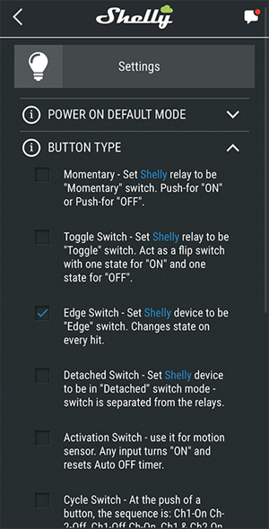
To be fair, I think it's a masterful implementation of the Shelly being able to toggle the circuit on every change of either kinetic or digital switch and I can't think of a better way of doing it with the equipment involved. (Incidentally, this YouTube video demonstrating the edge switch behaviour is what really sold me on the idea.) But it does leave the switch in that sort of inverted state. Mind you, that's no different to having multiple physical switches controlling the one light as many people (including myself) have in their homes. However, given the opportunity to make things a little more user friendly, I installed one of these in my entertainment room whilst doing some renovations:
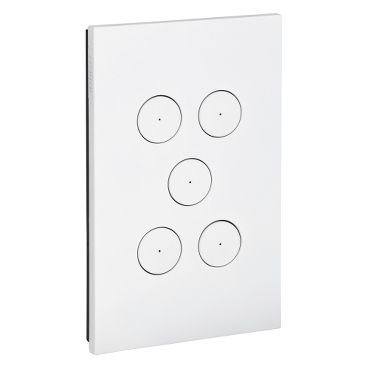
These are Clipsal Saturn ZEN units and the main reason I wanted them is that the buttons always return to the same state. To use Shelly's nomenclature from the screen grab above, they're "momentary" buttons that turn either on or off with just a push. Light on or light off, the only representation of the state of the circuit is the blue LED in the centre of the switch. You can see this in the earlier tweet with the embedded video and to my mind, this is the most intuitive approach possible.
But then there's dimmers and they're much more of a problem. If we pursue the mantra of "enable both kinetic and digital controls and have them work equally and intuitively", there's a sticky point: rotary dimmers such as the one in the aforementioned video have, for example, 270 degrees of rotation. At zero degrees the light is all the way down then at 270 degrees it's all the way up. The rotary dial has hard stops on both ends and the amount of light incrementally increases or decreases as it's rotated (again, a UX paradigm my parents understand well). But what if I were to dim the lights digitally? I can't do that with the Shelly 1, but I could do it with a Shelly Dimmer 2 which is also approved for Australia. Problem then is that I could turn it all the way up on the wall but all the way down digitally then stuff is really out of sync.
One approach is do precisely what the Lutron obviously does in the earlier images and that's to have buttons to increase or decrease the light hence moving away from any physical state representing the circuit state. I have a major issue with this from a UX perspective and it's simply this: it's unintuitive. I've got a couple of lights with push button dimmers and IMHO, the experience totally sucks in comparison to rotating a dial and having a smooth transition between the minimum and maximum light scales. I felt so strongly that rotary dimmers are the best UX that I decided to completely forgo digital control. In both the embedded videos in the earlier tweets, those lights are only dimmable by walking over to the switch on the wall. Part of my decision-making process here was that I rarely change the amount of light used and the infrequent change didn't justify forgoing the UX. I believe this position is entirely reasonable to take: not everything has to be connected and indeed there are times where doing so may well make for a worse user experience.
In an ideal world, I'd like to see a rotary dimmer that can sit behind my existing switches and just rotate infinitely. At some point, the light won't go any lower and at some point, it won't go any higher, but rotating clockwise increases the light level and vice versa. I appreciate that's a fundamental change in dimmer circuitry but from a UX perspective, that seems optimal.
Other Human-Centric UX Considerations
The examples above were picked to highlight points where connectivity can come at the expense of usability and how IMHO, that's not a sacrifice connected homes should be making. That said, there are places where I'm more willing to make concessions, such as the "media room" between my kids' bedrooms:
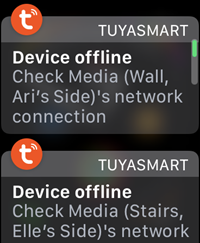
This popped up on my watch the other day because the cleaners had turned off the 4 downlights in the roof via the light switch on the wall (they're like my mum and dad - got a great grasp of how light switches work!) With no more power to them, they dropped off the network and Tuya sent me the alert. Of course, you can always just turn the light switch back on again and the lights will do precisely what you think they should do, but they could no longer be turned back on via the Aqara motion sensor I installed in that room.
As I progress, I'm toying with different approaches to handling this, for example:
I’m still toying which the right UX for connected lights controlled by a physical switch. In the kids’ rooms, I’m giving this a go: pic.twitter.com/cBLulGk5HE
— Troy Hunt (@troyhunt) October 19, 2020
To be clear, I don't think this is a particularly UX-friendly approach, but it's been fun toying with different connected things in order to see what actually sticks. I don't mind experimenting on the kids 🙂
A better option is to configure the Shelly as a "detached switch":
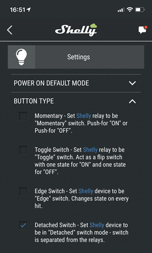
When in this mode, the actual physical light switch becomes "detached" from the light:
Detached mode is used when you don’t want the physical switch that is wired to the Shelly to directly control the light
This is great because it means that flicking the switch doesn't kill power to the lights (and remember, they're smart lights that can be digitally toggled themselves), but rather it can raise an event that can then be used as a trigger to perform an action. What action? Turn the lights on directly via, in this case, the Tuya integration. tl;dr - the light switch works precisely as mum and dad are used to, it's just the mechanics of how the lights are turned on and off that changes.
Continuing the theme of "does this normal everyday thing work the way I would expect it to", I recently installed Ubiquiti's G4 doorbell:
This rocks 😎 pic.twitter.com/S2doMzPxv4
— Troy Hunt (@troyhunt) November 10, 2020
Connected doorbells are nothing new and the likes of Ring and Nest are now pretty common. Part of the value proposition is that ringing the doorbell can send a push notification to your smart phone which you can then use to have a 2-way conversation with the person at the door, regardless of where you may physically be at the time. But what happens inside the home? Back in the day, the doorbell would be physically wired to a ringer such that you had an audible alert when someone arrived at your house and yes, you can purchase a "chime box" for the modern digital equivalents, but it seems that many people forgo this in favour of just the app. Having something ring within the house was non-negotiable for me, so my doorbell now rings the Sonos:
The doorbell press triggers a binary sensor in @home_assistant which then does text to speech via the Sonos. Cool 😎 pic.twitter.com/cYqZXqRyJj
— Troy Hunt (@troyhunt) November 10, 2020
I probably need to change that to something less annoying (like playing an actual ringing sound), but there's certainly no missing it when someone is at the door!
DIY or Professional?
This isn't strictly a UX issue (although it does relate to humans interacting with devices), but I'd be remiss not to mention it in this series. Throughout my IoT journey, I got a bunch of comments along these lines after sharing wiring pics:
Surprised the Aussie electrical licensing police are not onto you.
— Richard Spaven (@EUCNut) September 3, 2020
Australia is actually very heavily regulated in this area, much more so than other parts of the world based on feedback I've had. I gave an example of that earlier on when Lars had to return his SONOFF units because they weren't approved for use here. There's a very simple rule of thumb in Australia as to when you need a licensed electrician:
The most work you're really allowed to do without the proper qualifications is to change a light bulb
Touching anything to do with 240V mains is absolutely out of the question here and yes, it obviously costs money to get a sparky (electrician) out, but keeping the house standards compliant and most importantly, not electrocuting yourself is rather important.
Bottom line: make sure devices are approved for use wherever you may be based and also make sure you're aware of how much of this you can do yourself versus needing to outsource to a licenced professional.
Summary
IoT should add to the user experience, not detract from it. Of course, it's just like UX in the digital realm insofar as it needs to be tailored to the audience; if you are the sole audience and you're happy with how things work, you're good to go. But if your partner or friends or relatives or other people who need to use your house can't get their heads around it, I suggest that's a serious shortcoming.
Lastly, and as I've mentioned at the end of each of the blog posts in this series so far, Scott and I will be doing our live IoT session tomorrow (Friday 27 November here in Australia and in the UK), via the video below 👇
Series Links
- Part 1: It's a Mess... But Then There's Home Assistant
- Part 2: IP Addresses, Network, Zigbee, Custom Firmware and Soldering
- Part 3: Security
- Part 4: Making it All Work for Humans
- Part 5: Practical Use Case Videos