No, I didn’t camp out the front of the Apple store with my sleeping bag and frankly, I think those that did perhaps have what we refer to down here as “a couple of kangaroos loose in the top paddock”. Queues stretching hundreds of metres and adults in tears aren’t really my things (incidentally, crying over queue position is not something you do once you have your grown up pants on).
Instead, I went down to my local Telstra store (our local big telco) and stood behind 3 other people while I caught up on my email backlog for a couple of hours. They had a red carpet. There was free coffee – proper coffee! They even had a violinist playing in the store for crying out loud. 20 minutes after that I was out with a shiny new iPhone 6 Plus. No queuing around the block and no tears.
So now, with the light of several days of real world use behind me, what do I actually think if it? Is a 6 Plus all it’s cracked up to be? Or is it just too big and too clunky? A bit of both, here’s what I reckon:
Love 1: It’s big
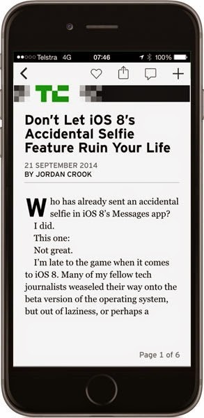
It fits a heap more content on the screen (yeah, I know, who’d have thunk it), but what it means in real terms is less scrolling and more consuming actual stuff. For example:
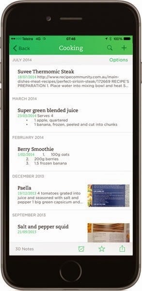
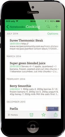
Here I’ve got a heap of extra space that gives me more content on the screen to read. The physical size of the text is almost identical (in this example the 6 Plus fonts are actually about 3% larger), but I’ve just got more of it. Clearly this is always going to be the value proposition for a larger phone but the significance of that isn’t always clear up until you actually use it for everyday tasks.
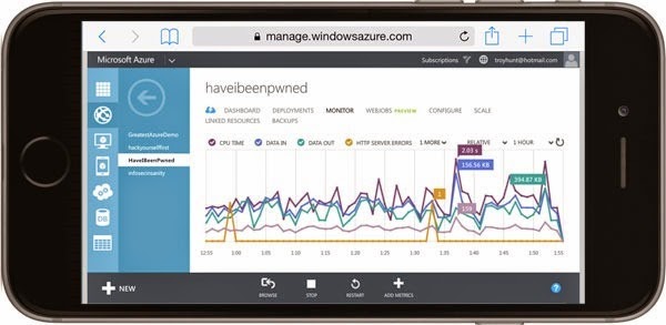
For example, managing my Azure Portal was pretty much impossible on the 5, but it’s actually feasible on the 6 Plus:
It’s not fun, but it doable and when the phone is the only connected thing on you and you really need to make an urgent config change, that’s a hell of a value proposition. There are heaps of similar scenarios where the difference in size changes what you can do; I’d probably watch some movies on it during transit when I’d normally resort to iPad. The tablet is still a better device for this (not least because it can stand up on its own), but the phone is now just that much closer in size it becomes more compelling for things it really couldn’t do well before. Or perhaps of more practical value, today I was actually able to use it to watch a presentation while on a teleconference on my walk to pick up the kids – now that is something very useful to me.
Hate 1: It’s big
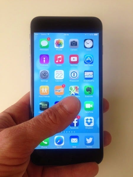
This is no single-hander; I can’t file an email like I used to or even click icons on the screen without doubling up on the hands. If I’m using my right hand, I can’t press the letter “a”, my left and I can’t reach the “l”. I’m 6’5” and have proportionately large hands, but it‘s one hell of a stretch. Holding it single-handed is a balancing act that you can get away with if you’re say, scrolling a news article but try holding a coffee in one hand and actually doing something with the other and there’s a good chance it will end in tears.
It’s not just because of the size of the screen it’s problematic though; on a smaller phone, you can hold it with one hand and extend your thumb across while your fingers underneath it retract a little (try it, you’ll see what I mean) but on the 6 Plus, those fingers are sort of at the extremity of actually holding onto the damn thing in the first place!
It also feels more top-heavy once you’re holding it towards the bottom and trying to use a keyboard because, of course, it is. You’ve got that much more weight leveraged out over the top of your fingers and its natural tendency is to want to sort of fall off the back. Reading some of the durability reports today, both the 6 and 6 Plus scored really well, but there was this:
The iPhone Plus 6, whose screen measures 5.5 inches, wasn't far behind but lost points because it could slip out of a person's hand since some users may have a hard time gripping its large but slim form
Yes – that exactly! Conversely, perhaps because people will be extra conscious they’re holding a rather large device in a precarious position they’ll be more careful, who knows. All I can say for sure is that it is in no way as comfortable to grip as the old 5 and inevitably not as much as a 6 without the “Plus”.
Love 2: Apps designed for it are awesome
There are a couple of ways of looking at this. Firstly, apps that make use of the additional screen real estate for the same content. The Evernote example earlier on is perfect; the physical screen size is 63% greater on the diagonal than the 5 so yeah, you’re gonna fit a lot more content on there when everything is scaled to be the same physical size.
Another angle apps can take is to rejig the layout based on the Plus’ newfound real estate. For example, the mail app in landscape mode:
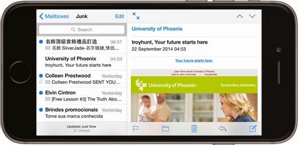
Now we’re talking about actually doing something functionally different with the space. Clearly that’s a bigger ask of the app to be designed in such an adaptive fashion, but inevitably we’ll see that happen more and more as time progresses.
Hate 2: Apps not designed for it look kinda screwy
Ever run an iPhone app on an iPad? At full screen? Yeah, it’s kinda like that sometimes, for example:
This is Flipboard, an otherwise awesome app that is now stretched out to the dimensions of that 63% larger screen. Consequently, everything is 63% larger than what it needs to be – think about how your grandparents would like to read content and you’ll get the idea. It’s a little bit like the days after the iPhone 5 launched with all that extra vertical real estate and a bunch of apps would just end up with centred content and black bars top and bottom. They immediately feel dated and they’re not all that fun to use, if I’m honest.
Of course it’s a hard ask of developers to deal with all those resolutions too; they’ve now got the old 5 (1136x640) the 6 (1334x750) and the 6 Plus (1920x1080) – and all that’s assuming we ignore the 4 already at 640x960. There’s a really good page titled iPhone 6 Screens Demystified which does a great job of explaining just how much these devices differ not only in resolution, but also in pixel density and scaling. I get that this isn’t an easy ask of developers (although certainly Apple are heavily pushing cross-device compatibility), but the bottom line is that a lot of apps are going to look dated for a long time.
It’s not just third party apps though, to my eye some of the native OS stuff just looks unbalanced:
It’s like the “white space” just isn’t correctly proportional to the button sizes. It felt cohesive on the iPhone 5, it feels a bit slapped on in the 6 Plus. Maybe it’s just me, weigh in on this if you’re an actual designer!
Love 3: The front is beautiful
This, is sensational:
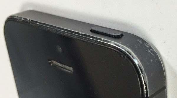
The curved glass that extends all the way to the edges feels beautiful to hold and slips into the (very big) pocket oh so nicely. A lot of it has to do with the rounded edges too which IMHO, are a big step forward. It makes sense too when you look at the way the edges of the 5 wore with time:
All those hard edge tend to cop a beating in a way the 6 doesn’t look like it will. Of course that’s relevant to both the 6 and 6 Plus too, as are the complaints…
Hate 3: The back looks like a half-finished prototype
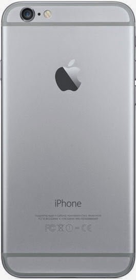
This will probably look ok – once they finish it:
Wait – you mean that’s it?! There’s just something about those beads around the top and bottom sections that feels, well, plasticy. I’m sorry guys, but it really feels half-arsed like someone has taken to it with a caulking gun. You’ve got all this beautiful brushed aluminium finish them WAMMO! Plastic bits.
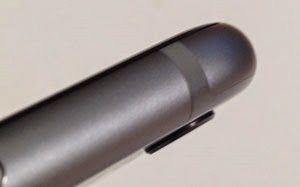
It’s not just the plastic bits though, it’s this too:
The camera lens noticeably protrudes from the body such you continue to return to it and rub your hand over it like an unwanted protrusion on your own body. It’s weird and yes I know the 6 Plus gets an optical stabiliser and maybe that accounts for it, but it’s just, well, weird. It’s not Apple-like.
In summary…
For me, the Plus makes sense because of the way I use it and because I’ve got the hands for it (that sentence sounds worse than it should, but you get the idea). My wife has a normal 6 sitting downstairs in a box waiting for her and undoubtedly that’ll be the better phone for smaller hands that don’t need to load the Azure Management Portal. Even though the reported demand doesn’t reflect it, it’s probably the better phone for most people regardless of the size of their hands.
But I’m happy and so long as I don’t drop the damn thing trying to fumble my way through a speedy email response, I think it’ll actually serve my purposes very well :)
