It seems that there is no limit to human ingenuity when it comes to working around limitations within one's environment. For example, imagine you genuinely wanted to run a device requiring mains power in the centre of your inflatable pool - you're flat out of luck, right? Wrong!

Or imagine there's a fire somewhere but the hydrant is on the other side of train tracks and you really want to put that fire out but trains have still gotta run too - what options are you left with? None? Wrong again!

Seeing a theme here? Let's extend that into the digital world and we'll talk about HTTPS for a bit. You should use it. No really, if you're not HTTPS'ing all your things then you're doing it wrong. The browser vendors know this and they're increasingly holding non-compliant websites to account. That really ramped up in Jan when both Chrome and Firefox started displaying warnings when a login form was served insecurely. Not everyone was happy about this because hey, HTTPS is hard, right? No, it's not, but that didn't stop Oil and Gas International from logging a bug report with Mozilla:
Your notice of insecure password and/or log-in automatically appearing on the log-in for my website, Oil and Gas International is not wanted and was put there without our permission. Please remove it immediately. We have our own security system and it has never been breached in more than 15 years. Your notice is causing concern by our subscribers and is detrimental to our business.
Which clearly, is hilarious because "causing concern by our subscribers and is detrimental to our business" is exactly what browser vendors are setting out to achieve! This is the lever that forces organisations to go secure when common sense alone doesn't do it. (Incidentally, I believe their 15-year streak came to an abrupt end as they suddenly started receiving free penetration tests once this "bug" was socialised.)
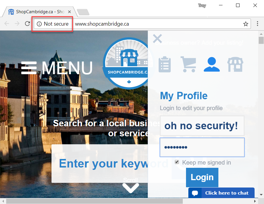
So, what's to be done? Well clearly given the warnings are detrimental we have to get rid of the warnings all together! No really, someone has actually done this:
Frustrated by Firefox's pesky security warnings about insecure login forms scaring your users? Try this one neat trick by @shop_cambridge! pic.twitter.com/FlrotYe1De
— Troy Hunt (@troyhunt) October 31, 2017
This actually came through to me just yesterday via someone who described the chat they'd had with a representative from ShopCambridge.ca as follows:
I’ve been speaking with the owner about SSL before I invest in becoming a member, but she’s been told by the dev of the platform (it’s a franchise system called ShopCity.com) that SSL is more about Google’s monopolizing visibility of content, and less to do with security
I'll come back to ShopCity.com a bit later, for now, let's break this down and marvel at the magic of what's going on here: Firstly, the browser warnings about an insecure login only fire when there is an input type of "password". But here's the clever bit - whilst that might look like a password field in the tweet above, it's not:
<input id="pw" placeholder="Password" name="pw" maxlength="100" class="textbox" style="width:230px;margin-bottom:5px;" onclick="javascript:this.placeholder='';" type="textbox">
Ah, it only says "Password", it's actually just a type of "textbox". There's a single CSS class on it for some visual styling but once clicking on the field, something magical happens:
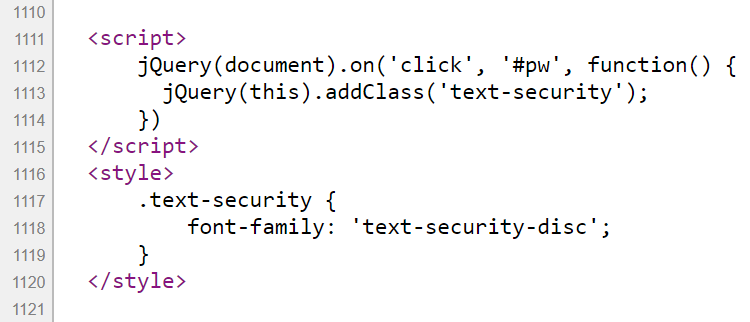
<script>
    jQuery(document).on('click', '#pw', function() {
        jQuery(this).addClass('text-security');
    })
</script>
And now we have a totally new class on the field. Plus, of course, the onclick event on the input box itself sets the placeholder text to an empty string. So what does the class do? It merely changes the font:
.text-security {
    font-family: 'text-security-disc';
}
And as you've probably guessed by now, that "font" is nothing other than a single disc per character designed to be a visual representation of the real disc you'd normally see when entering text into a proper password field. It needs to work in this order because otherwise the place holder would no longer say "Password" and you'd instead see 8 round discs representing the letters of the word. The bottom line is, once all this is tied together then there's the veneer of a password field but because it isn't a password field, there's no browser warnings! It's like magic! More specifically, it's a pseudo password field designed to fool the user and deny them of the browser's visual warning designed to protect their password.
Both the JS to add the class and the CSS to apply the font have both been added inline in the page source too, as though it's an afterthought:

Actually, that same block of JS and CSS is in there twice, once on line 1,111 and again on line 1,156. The most likely explanation I can come up with for this is that sometime this year, the browser security warnings started appearing and some enterprising developer somewhere went "I know how we'll fix this". Oh, and incidentally, the font they're using has been around for at least 2 and a half years which well and truly pre-dates the browser security warnings this "fix" has been designed to address.
This is clearly ridiculous and it didn't happen by accident either. I mean there wasn't some other design decision made and then, as a by-product, the browser security warning disappeared. This is a premeditated attempt at hiding valuable security feedback designed to protect the user. Fortunately, this stupidity no longer flies in Chrome 62 and as I wrote in my recent Happy Path to HTTPS post, this behaviour is gradually rolling out to everyone:

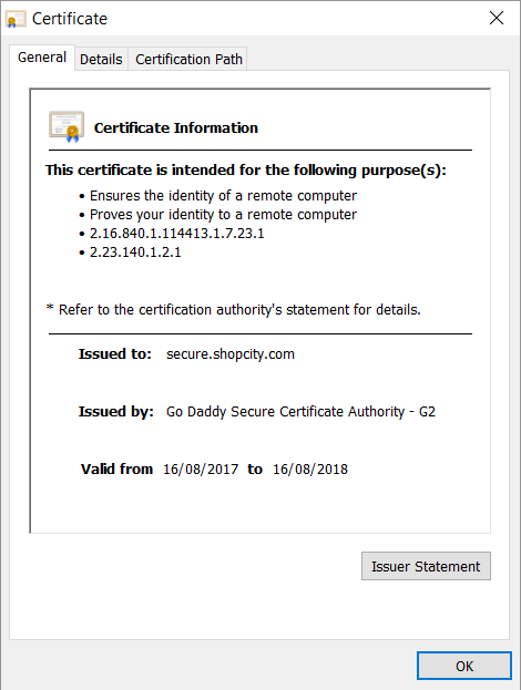
Ideally, we'd see the same behaviour replicated in Firefox too and Scott Helme has already logged a bug with Mozilla about ShopCambridge.ca's shady behaviour. But clearly, the deeper issue is a fundamental misunderstanding of the technology on ShopCity.com's behalf. If you recall, they were the ones who were mentioned in the original message I received and you can see them following this same pattern on sites such as ShopMidland.com. Trying to load either of the non-secure sites over HTTPS results in an invalid cert being served, one for ShopCity.com:

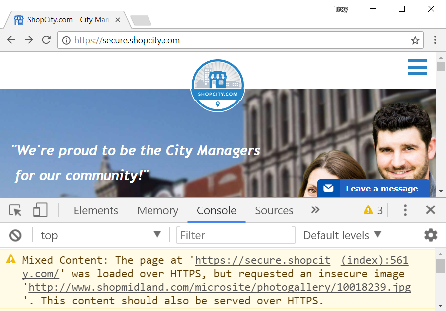
Except it's not for ShopCity.com, it's for Secure.ShopCity.com and if you try loading https://www.shopcity.com then you're hit with another security exception because, of course, the cert isn't valid! So I tried loading https://secure.shopcity.com instead, except that's (a bit) broken too:

It's all starting to look like they simply don't care about serving content securely, which brings us back to their earlier comment: "SSL is more about Google’s monopolizing visibility of content, and less to do with security". I've heard this before from what I can only describe as the anti-vaxers of the technology world and they include comments like this:
Google is just a bully because it is so big. It can go f*ck itself.
His rationale was that because a site he worked on had some shoddy code and a nefarious party managed to modify the site yet the padlock remained, HTTPS is useless. A trawl back through the SSL tag on this blog shows other similar responses where amazingly, there are others who also think that this is just a protection racket run by Google.
I did actually reach out to ShopCity.com to ask them why on earth they did this, but at the time of publishing there'd been no response.
So, what should these guys do? It's really very simple:
Just use HTTPS, for fuck’s sake.
— ɹǝqǝʍ uıʇɹɐɯ (@web_martin) October 31, 2017
For folks wanting to move to HTTPS, check out The 6-Step "Happy Path" to HTTPS I mentioned earlier. It's easier than ever and it doesn't even require deceiving your users!