Fresh from the 2012 MVP summit with lots of enthusiasm and grand ideas, I thought it would be worthwhile repeating my 25 illustrated examples of Visual Studio 2010 and .NET 4 post with the technologies of today (or should that be tomorrow?) albeit a few weeks later than I had planned. There are some very, very exciting new things in the pipeline which I’d like to share while they’re fresh in my mind and analogous with that post from two and a half years back, I’d like to actually show you what’s happening.
There’s so much great new stuff in Visual Studio 11 that it deserves its own post! If I can create the time, I’ll also try and get around to covering ASP.NET specifically. Keeping in mind I’m a very web-centric guy, let me show you some of the features which have gotten me a bit excited about what’s coming in the very near future.
1. Its grey (and other UX changes)
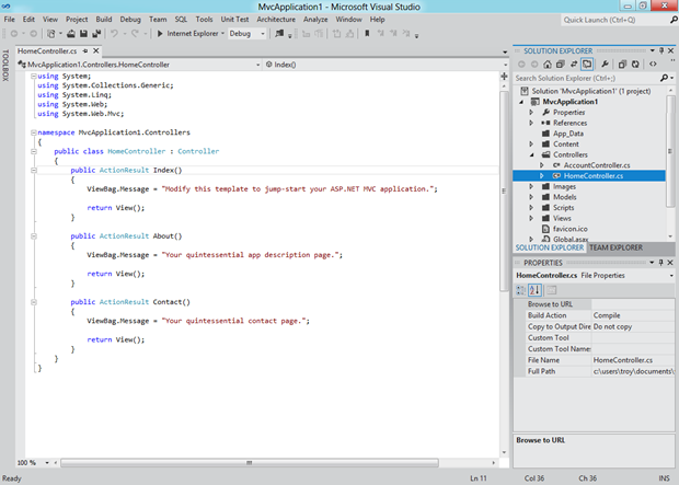
Let’s just get this out there right now; the new Visual Studio UX is polarising. Actually, polarising would suggest there are two different views of it. The reality is there is a strong chorus of “Ugh” at the moment. You see it’s all about Metro these days and that means VS 11 now looks like this when running on Windows 8:
Just in case you need a little reminder of how things used to look, here’s VS 2010 on Win 7:
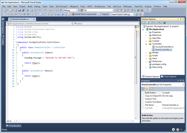
There are three things I want to call out in VS 11 as they’re the three which are repeatedly brought up:
- The greyness.
- The capitals on panel titles.
- The colons on the panels.
You can get a better idea of those last two items here:
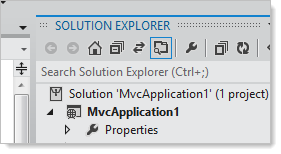
The theory is that all those nasty colours get a bit distracting when what you really want to be doing is focussing on code, not file icons or buttons on menus. Many people countered that with “Yeah, but I minimise all my panels anyway”.
So what do we make of all this? Well, the feedback I’ve seen and heard honestly hasn’t been positive. Sure, it’s Metro and Metro is the new black but it almost seems to be Metro in name more than anything else – certainly it doesn’t jump out and remind me of the Metro I know from Windows Mobile 7 or Windows 8.
One very apt comment I heard in one of the sessions was that Metro is great for, say, a mobile app but an IDE is a very different paradigm. Does that mean Metro won’t work in VS? I don’t know, but certainly it’s a very different context.
Love it or hate it, the thing is that this is a first beta and things will almost inevitably change to some degree. I suspect the release version won’t be too far off the preview version, but clearly some refinement will still happen. This is evident in a few places where colour is still evident:
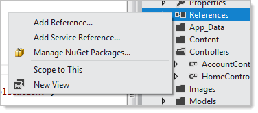
And:
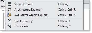
As a closing thought on UX, the only other thing I’d say is “use it”. Give it a go and see if it really does impact the development experience and if that experience is negative, then come back and complain about it :)
2. Quick search
This one is actually very cool and should offer a major productivity advantage. Up in the top right corner of the IDE we now have a little “Quick Launch” text box which you can shortcut to with CTRL-Q. I look at this as the Visual Studio equivalent of the Windows key in Windows 7; hit it, type whatever you want then it will find it for you. For example:
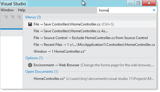
In this case, VS has found everything from menu items to configuration options to open documents. There are also other categorisations it searches for and I think this is going to be one of those super useful features that you soon wonder how you lived without, just like that aforementioned Windows 7 feature is for me now.
3. Backward solution compatibility
When I started rolling out Visual Studio 2010 in my workplace, one of the greatest hurdles to adoption was the solution file format. Once you opened a .sln created with an earlier version of the IDE you had no choice but to upgrade the solution version. Doing this then meant no going back (without some nasty hacks) so in short, either everyone who might possibly work on the solution upgraded to the new IDE or nobody did. And then if you worked across multiple project versions you needed to run multiple versions of the IDE. Nasty.
Here’s how Jason Zander explains it in his introduction of VS 11:
The compatibility improvements in Visual Studio 11 will make it easier to work with your existing Visual Studio assets, without doing any “upgrades” of project files. In the majority of cases, you can use Visual Studio 11 and also continue collaborating on projects with your teammates using Visual Studio 2010 SP1.
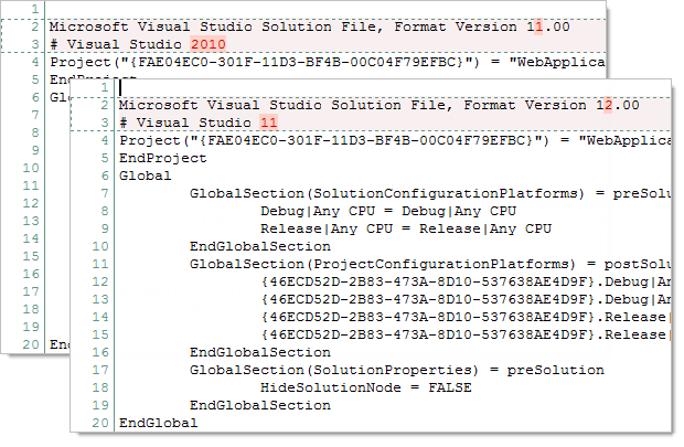
To demonstrate this new friendly behaviour, I created a VS 2010 web application then opened it up in VS 11. Here’s the difference between the two solution files:
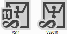
This will cause some minor differentiation in the logos:
But the important bit is that after opening the solution in VS 11 you can still jump back into VS 2010 and things work just fine:
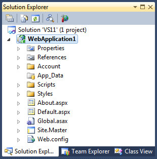
Look at all that colour! The only caveat in all of this is that you still need to be on VS 2010 – this isn’t going to help projects stuck on earlier versions of the IDE.
For me personally, this is going to make rolling our VS 11 significantly easier as it can be done more on a needs basis rather than just because you want to open a solution someone with the newer IDE worked on.
4. Smarter Solution Explorer
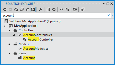
There’s a bunch of new stuff the Solution Explorer can do that we either didn’t have before or was nested over in other windows such as the Class View. What’s neat about this revision is that the Solution Explorer becomes a real hub for all sorts of activities:
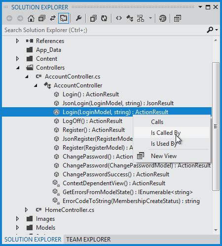
The search feature also makes an appearance so finding those pesky files nested down under five folders becomes a pretty easy task (note it also searches for class members – not just file names):
5. Find and replace goes lightweight
First a quick reminder of what the good old CTRL-F would do for us in VS 2010:
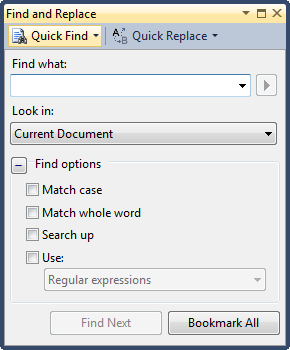
A great big dedicated panel with lots of options. Compare that now to how VS 11 approaches things:
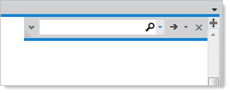
Ok, that’s a rather streamlined approach! In case you’re wondering where all that missing stuff has gone, it’s still there:
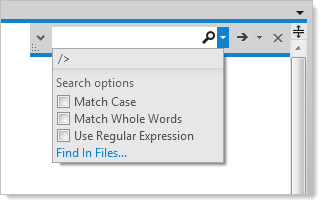
You’ll notice that the control is also resizable so if you’ve got a fetish for long searches you can keep it all visible in the text box. And if you really long for the find and replace of old, you can CTRL-SHIFT-F back into it:
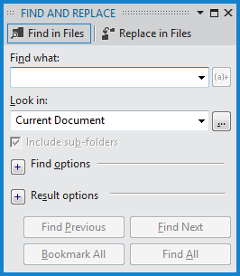
Does all this feel just a little bit familiar? It did to me, because my VS 2010 already behaved in this fashion courtesy of the Productivity Power Tools so it’s interesting to see that Microsoft has just gone ahead and rolled this into the IDE as a first class citizen.
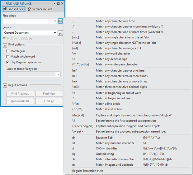
One more thing; if you’re like me and have trouble wrapping your head around regexes, there’s more help at hand than we had before:
6. Windows 8 ready
There should be no surprises here given the timing, but VS 11 now comes with a bunch of Metro project templates ready for Windows 8:
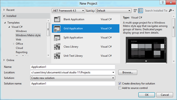
One important thing to note though is that you’re going to have big problems building a Metro app if you’re not running Windows 8. Developers on Windows 7 or – gasp! – earlier versions of the OS are going to need to get with the times first.
7. CSS editing gets much cooler
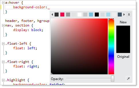
There are a number of enhancements in the CSS editing space but here are a few of my favourites. Firstly, there’s a built in colour-picker which pops up in any context where it might make life a little easier for you:
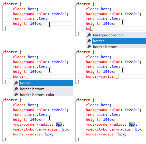
The other neat little feature is the ability to pre-fill browser specific schema prefixes on certain CSS attributes. For example, begin making a “border-radius” entry, hit “tab-tab” and watch the magic:
Here’s another new one: what’s wrong with the following CSS?
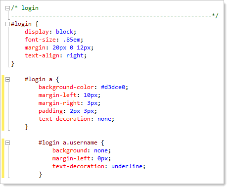
Answer: nothing. The indentation you’re seeing is hierarchical; the tag with the ID “login” may have an anchor tag which may then have a “username” class. It looks a little odd at first but I suspect it will become advantageous in terms of helping you properly structure your CSS in a logical fashion.
These are little enhancements, but they contribute to the overall increased productivity theme we see in each release of the IDE.
8. Image previews
From the “small but handy” file, say hello to image previews:

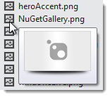
There’s not much to say here beyond what you observe above; hover the mouse over an image and a little thumbnail pops up. Saves you accidentally selecting the wrong file at times and avoids having to actually open the entire file one by one. Quickly flicking through images is now dead easy.
9. Choosing a browser to run the app in is finally easy
I don’t know what it was about earlier versions of the IDE, but no matter how many times I set my default browser to IE (right click file –> browse with), it would always revert back to my OS default (Chrome) when I pulled the project up at another date. The fact that Hanselman had enough material on this for a lengthy blog post is evidence that this hasn’t exactly been a smooth experience in the past.
VS 11: problem solved. Right up there next to the run button is the ability to choose the browser you want to fire up:
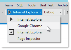
This is a significantly better implementation as not only do you always have the browser F5 is going to give you right in front of you, but it’s dead easy to change it. That old “Browse with…” option was painful because it was usually only after the solution built and fired up the wrong browser that you realised there was a problem. And then try getting the “Browse with…” dialogue up on an MVC app; can’t do it on the controller, can’t do it on the view so you end up creating a temporary HTML file just to access the dialogue! Maybe there’s a better way I’m not aware of, but fortunately it doesn’t matter anymore anyway.
10. Page Inspector (it rocks!)
One very, very cool new feature is the page inspector. Once you move away from the one file per rendered page paradigm and get into things like master pages, user controls, layout pages and partial views, things start getting very messy when you want to work out where rendered content in the browser is actually coming from.
Enter the Page Inspector. Let’s just take a look at it then I’ll run through the highlights. Firstly, you can run it up directly from what is usually your run button:
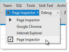
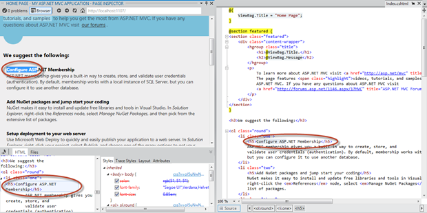
Which then gives you the site running within the IDE plus a couple of new windows (click to enlarge):
What’s happening here is that the site is running in the top left panel and I’ve selected part of the heading. We’re then seeing this selection in the bottom left panel like you’re probably familiar with in the IE9 developer tools. Next to it is the CSS that has been applied.
The real magic though is the panel to the right. Here you can see the actual file containing the selected text, in this case it was “Index.cshtml”. Regardless of the file the text was contained in, Page Inspector will find it and highlight it in the source.
But wait – there’s more; you can now change content in that right hand panel and VS 11 will allow you to refresh the Page Inspector view and see those changes immediately reflected in the page:

Unlike using the IE9 developer tools or a product like Firebug, this is actually a means of actively evolving the code – these are “sticky” changes which are saved to the source file and persist beyond this instance of Page Inspector. If this all sounds a bit hard to visualise, check out the Channel 9 video of Page Inspector in action. Very, very cool.
Summary
Firstly, a little piece of good news from Jason Zander if VS 11 is looking appealing to you:
Visual Studio 11 Beta meets our “Go Live” quality bar for pre-release software. Therefore we are recommending it for use in production, and supporting it as “Go Live” release.
Of course you can still work with your .NET 4.0 and earlier projects with VS 11 so using the new IDE is no way needs to drag your apps into the new version of the framework. Based on my experience of using VS 11 on Windows 8 in a VM it certainly seemed just as stable as 2010 on Windows 7. Having said, I don’t think I’ll be taking any risks with my work machine just yet.
So overall feelings? Other than the grey, it’s continued incremental improvements across a wide range of areas. Actually I’m not saying the grey isn’t an improvement, it’s just something I’m yet to fully adapt to. Like the previous couple of versions, all of these little improvements add up to a smoother, more productivity experience rather than one massive bang from a killer feature (although Page Inspector might get close to that for some). Positive steps forward, I reckon.
References
- What's New in ASP.NET 4.5 and Visual Studio 11 Beta
- Visual Studio 11 Beta in Context
- Features NO ONE NOTICED in Visual Studio 11 Express Beta for Web
- Decoding the use of grey in Visual Studio vNext
- Improving Find & Replace in Visual Studio 11 Beta
